
The success of your business no longer depends on whether your website “just works on mobile”. Today’s customer expects a website to be designed with the phone user in mind. It’s not just a design choice, it’s a business imperative – first contact with your brand is increasingly made on the small screen.
First impressions are made on the phone
Customers are increasingly using their phones to visit websites. The mobile experience is no longer an add-on, but the main way people engage with your business.
Globally, mobile usage accounts for well over half of all usage. In Estonia, where business customers also search for information on their phones, a poor mobile experience is a direct business risk. A bad first impression can cut off a sales opportunity in seconds.
In addition, Google rates websites primarily on how they perform in the mobile view. This means that the mobile experience has a direct impact on your findability and reliability in search results.
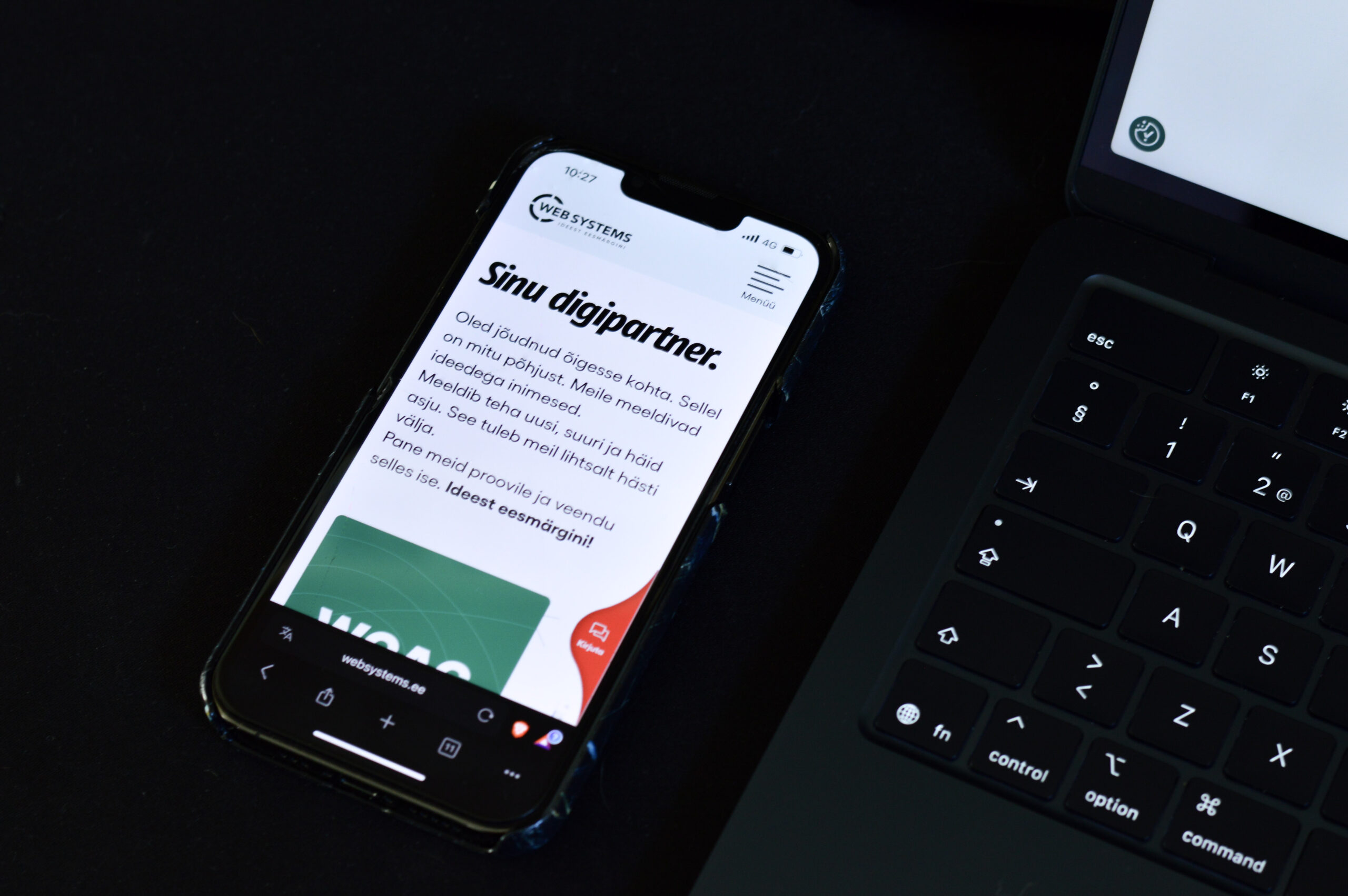
Three steps to turn the mobile experience into a business advantage
Speed as a competitive advantage
The slower a page opens on your phone, the more users will opt out. According to Google, every extra second of loading time can significantly reduce visitor retention. Some studies suggest up to a 32 percent drop, but the impact depends on the specific context and device.
Quick fixes without going into technical details:
- Reduce the size of large images and avoid excessively large slides.
- Avoid pop-ups and animations that interfere with reading.
- Remove unnecessary widgets and scripts.
- Choose a faster web browsing experience; use a content delivery network (CDN) if necessary.
- Make the front page shorter and divide the content into separate sub-pages.
A user experience that builds trust and confidence
A good mobile website is readable, easy to navigate and predictable. This means clear content architecture, easy-to-understand headlines and convenient touch areas.
Call to Action (CTA) – what it is and why it matters
What is a CTA? A button or link that takes the user to the next step (for example, “Request a quote” or “Contact us”).
Why is this important? On mobile, the focus window is short – if the call to action is always at hand, the user doesn’t have to search for it and moves forward more smoothly.
How to place it? Keep the primary CTA visible without scrolling and fold it in logical places within the page. If necessary, a permanent bottom bar will also work well.
Size and wording: the button must be easy to press and the text must be specific and easy to understand.
Good vs bad mobile menu
Two levels maximum: e.g. Products → Sofas, not Products → Sofas → Corner Sofas.
Bad menu: too many levels, overlapping categories, full-screen menu and unclear closing.
Good menu: 1-2 levels, clear and short headings (e.g. “Services”, “Jobs”, “Price List”, “Contact”), visible search and persistent contact button or CTA; closing should be intuitive.
Common mistakes on Estonian websites and simple solutions
- Small or proximate buttons – increase touch areas and add enough empty space between buttons.
- Horizontal scrolling – resize images and elements to fit all content on the screen.
- Contact button disappears when scrolling – make the main menu or CTA sticky so it stays visible on the screen throughout your browsing.
- Call to action (CTA) at the bottom of the page only – add an important CTA at the top of the page so the user does not have to scroll to find it.
- Overly intrusive pop-ups – prefer unobtrusive notifications and allow easy closing.
- Forms that are too long – only ask for essential information to make it quick and easy for the user to complete the form.
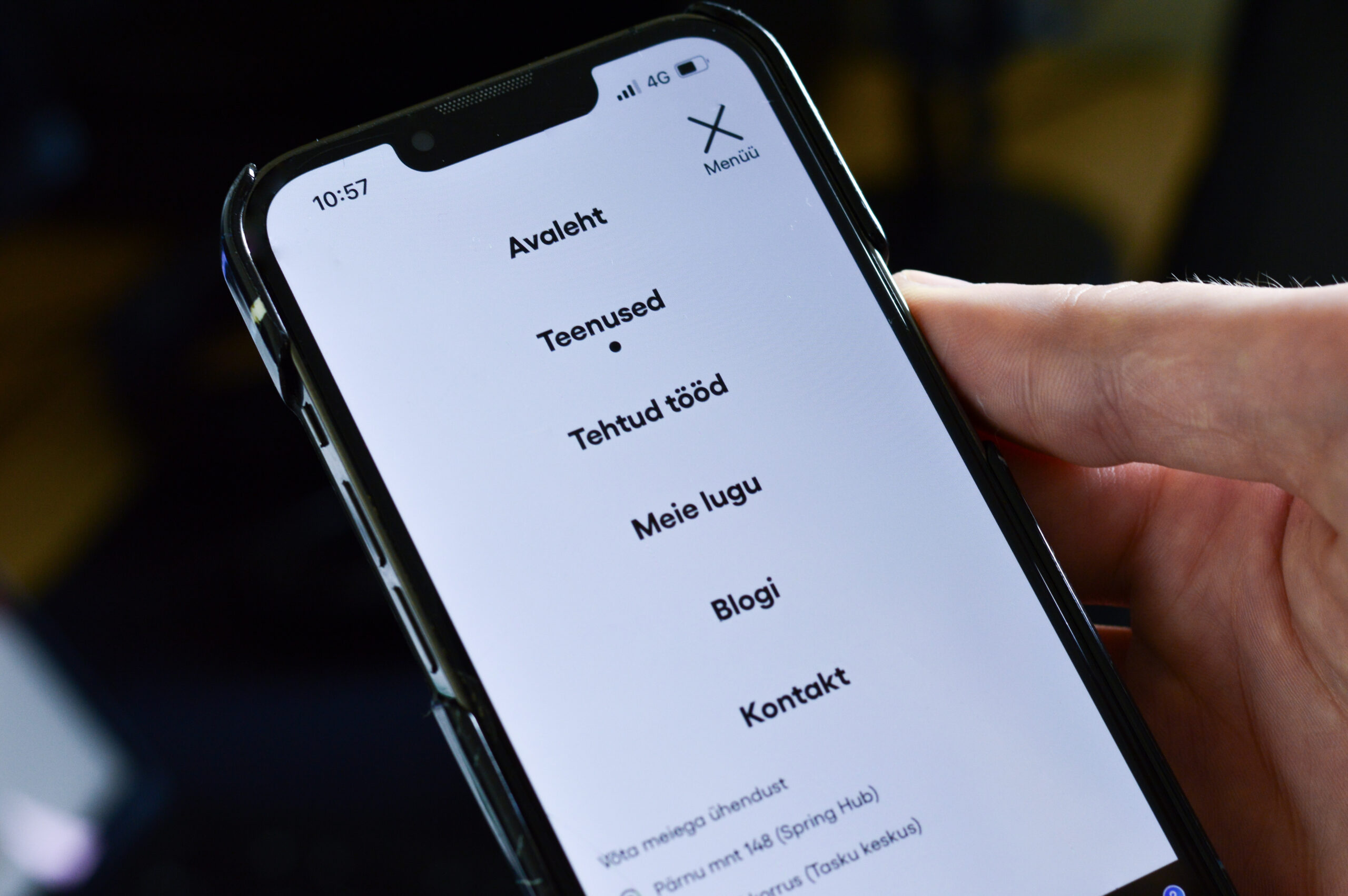
Navigation leads to the destination
If a user can’t find the information they’re looking for in two to three taps, you’re more likely to lose a customer. Navigation isn’t an extraneous detail – it’s an essential part of the sales funnel.
Main rules:
- A maximum of six headings in the main menu.
- Avoid the tertiary menu.
- Always keep contact in the same place.
- Make the search function easy to find.
Recommendations:
- Map key paths (for example Home → Service → Sample project → Contact) and keep them as short as possible.
- Keep the menu to one or two levels; if there is a lot of content, use summary pages with filters rather than additional menu levels.
- Use the same names and locations of calls to action (CTAs) and contacts on every page.
How to start optimising your mobile view (easy guide)
- Check the situation with Google tools
- Google Search Console: see the “Mobile Usability” and “Core Web Vitals” reports. Start with the pages where the problems are the greatest.
- PageSpeed Insights: test home page and main service tabs. The aim is to reach the green zone and implement the first simple recommendations.
- Adapt content for mobile
- Shorten headings, divide text into paragraphs, add subheadings and bullet points.
- Replace large images with lighter, faster-loading versions.
- Test operational requests and key activities
- Make sure the main CTA is visible right at the top of the page, easy to click and leads in a logical step to the contact – for example, through a short form, a clear promise and a thank you page.
How to measure the success of mobile optimisation
A clear picture emerges when you consistently monitor the same indicators and compare results over time.
- Engagement rate in Google Analytics 4 – are users interacting more actively with your page?
- Session duration and depth – do visitors spend more time and go deeper into the content of the page?
- Conversion rate – have you seen an increase in the number of enquiries, bookings or purchases made by mobile users?
- Depth of coverage – are users reaching the important calls to action? If not, move them to the top of the page or shorten the content.
Set an initial starting point and clear targets for 30, 60 and 90 days. Review results monthly – make a change, measure impact, take the next step.
Practical tools
- Google PageSpeed Insights – provides an overview of page load speed and recommendations for improving it: pagespeed.web.dev
- Google Search Console – shows mobile usability and Core Web Vitality reports: search.google.com/search-console
- Lighthouse – browser-based audit to assess reliability, accessibility, SEO and best practices: developer.chrome.com/docs/lighthouse/overview
Mobile is the new normal
The numbers speak for themselves: 69% of Estonian consumers shop online using their mobile phones and over 63% of all e-commerce turnover comes from mobile devices. This share is steadily increasing. Successful businesses know that a mobile-optimised shopping experience is no longer an option, it’s the minimum to compete.
E-shops and service providers are the hardest hit. If mobile is difficult to navigate, the page opens slowly or the purchase process is cumbersome, a potential customer will simply move on to a competitor. All it takes is one wrong touch or an excessively long wait and the sale is gone.
Over 69% of your customers browse websites on their phone. Is your website ready?
At WebSystems, we know how to create mobile experiences that not only look good, but sell. Get in touch with us – we’ll review your website and show you how to increase mobile user conversion rates in the first month.
